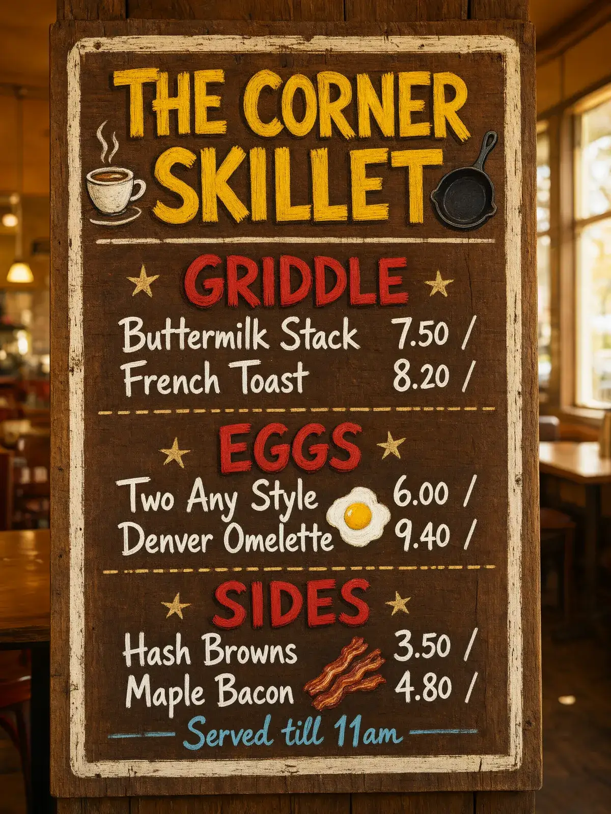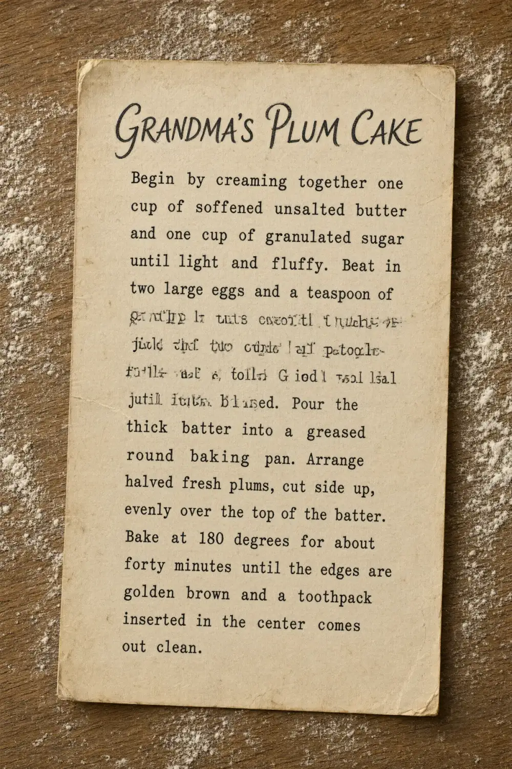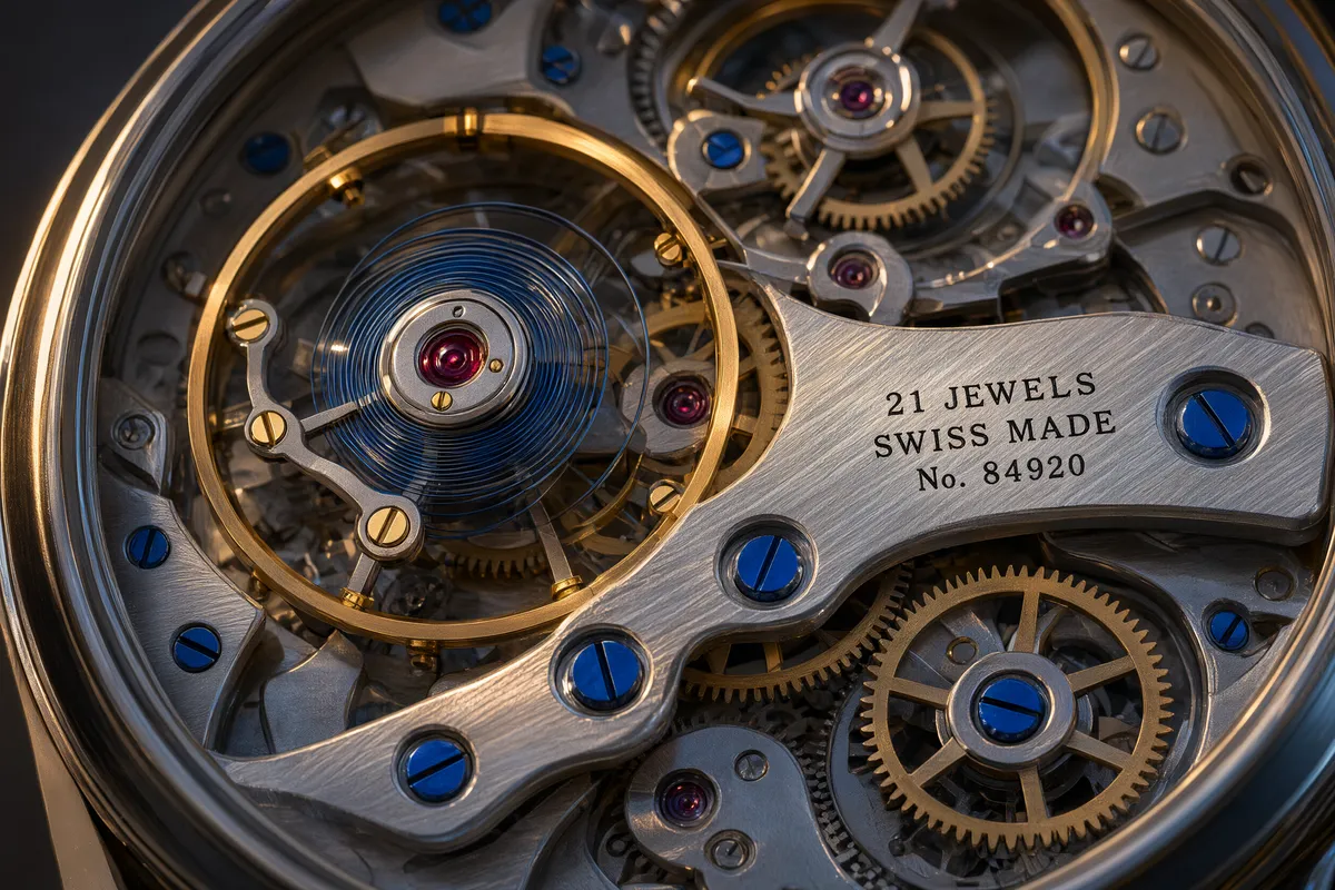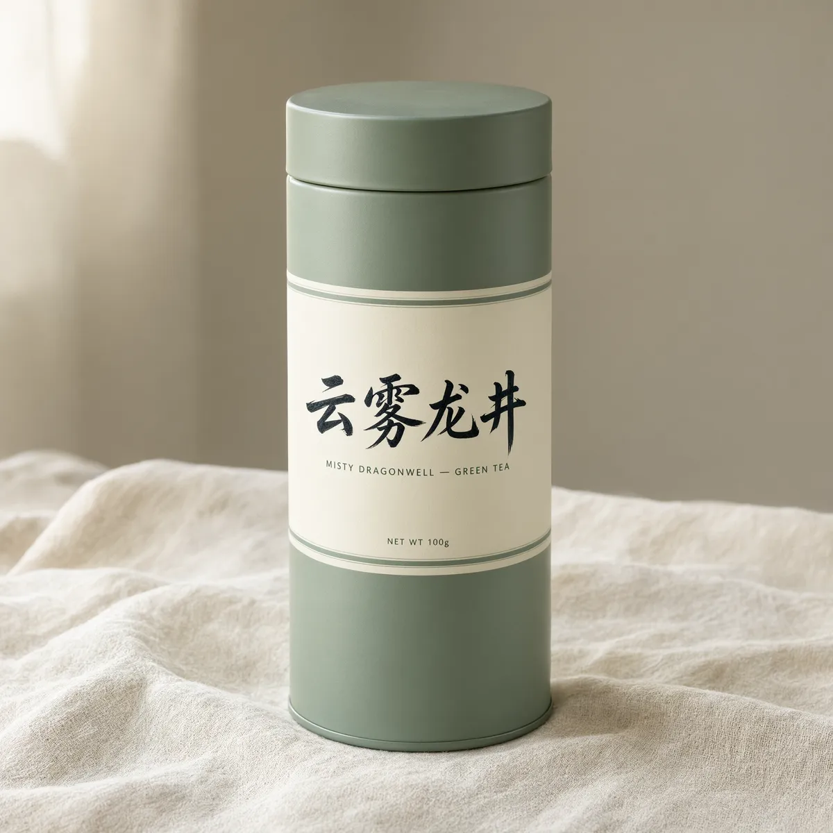
Chinese typography it sets like a native
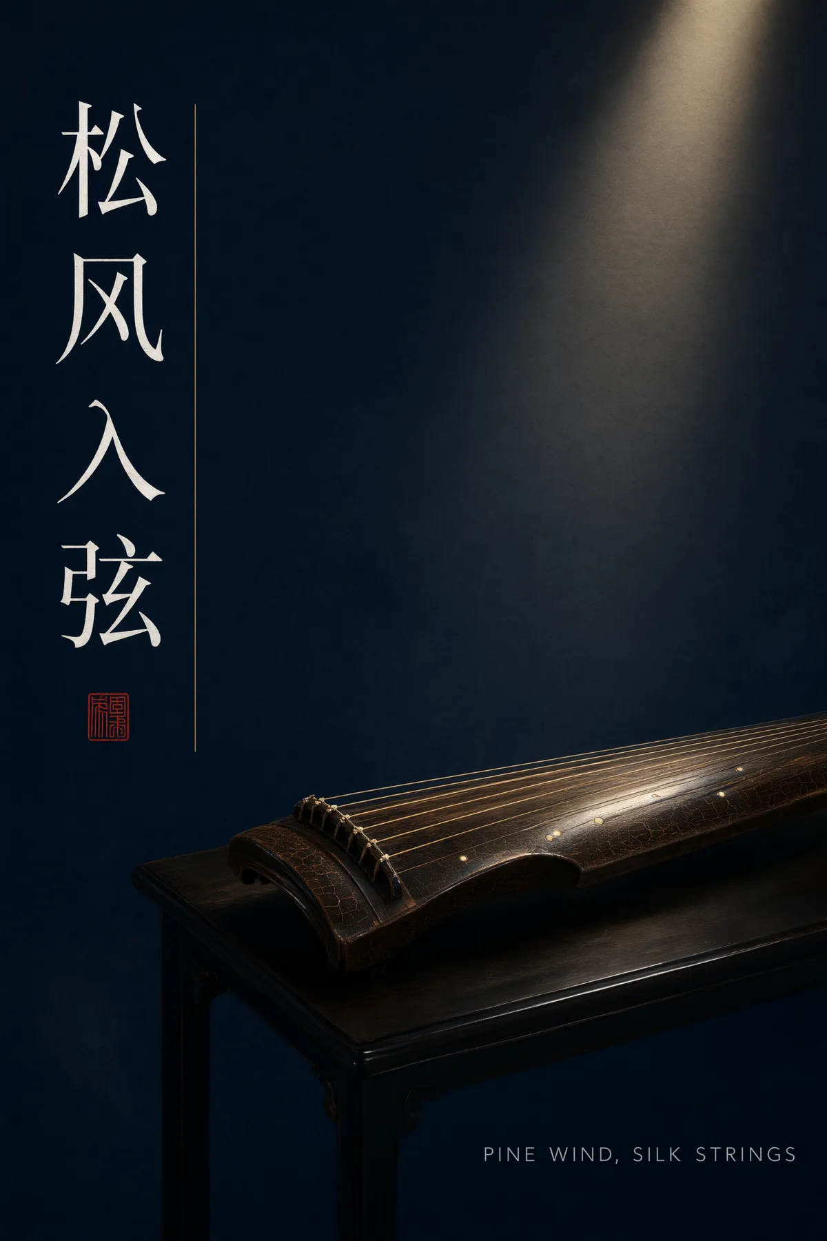
This is the home ground of the Qwen image family. We asked for a concert poster with a four-character Chinese title running vertically down the left in a songti face, and got exactly that: every character correct, the stroke weight consistent, the English subtitle spelled right in spaced capitals — and a red seal chop by the title that was not in the brief, which is precisely what a designer trained on Chinese poster convention would add. The bilingual tea tin further down this page came back with both scripts correct too. If your work switches between English and Chinese in one frame, this is the strongest reason to pick this model.