Layouts that come back typeset
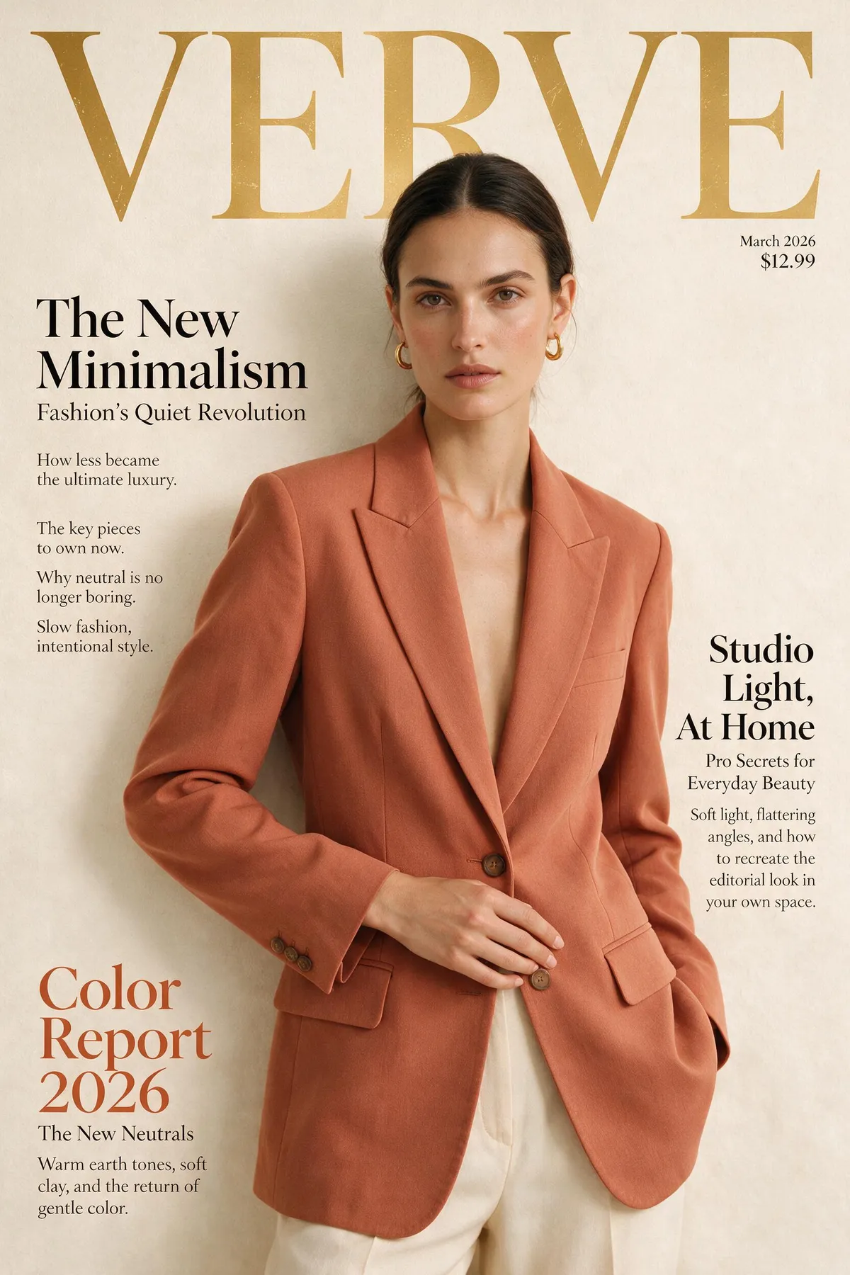
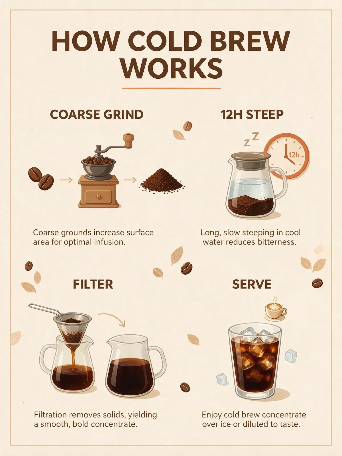
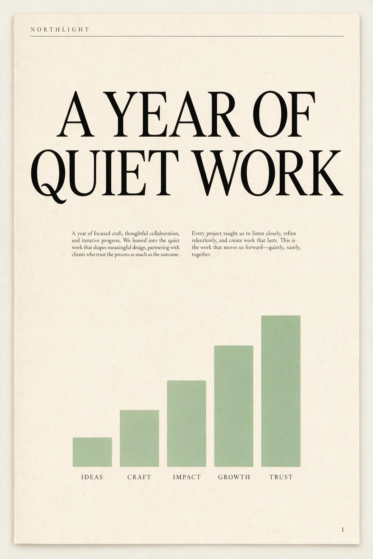
The official pitch is "beyond generation — it understands design", and this is where that shows. Give it a layout brief with named parts and it builds the hierarchy before it renders: masthead, headline, deck, body columns, captions, footer. The two below are unedited first takes from long single-paragraph briefs; read the prompt beside each one and count how many of the instructions actually landed. Body copy at this size is normally where image models fall apart into squiggles — here it stays real, readable English.
A single-page annual report cover for a design studio called NORTHLIGHT. Layout from top to bottom: a thin rule across the top with the studio name set small in wide-tracked uppercase on the left; below it a large two-line headline 'A YEAR OF QUIET WORK' set in a high-contrast serif; under the headline a short two-column block of small body copy; in the lower half a simple bar chart of five ascending bars in muted sage green with a one-word label under each bar; and a page number set small in the bottom right corner. Cream paper, ink-black type, one sage accent, generous margins, genuinely typeset editorial hierarchy.
A concert poster for a jazz quartet. Layout: at the top, the venue name 'BLUE ROOM' set small in uppercase with wide letter-spacing; centred beneath it the band name 'THE MERIDIAN FOUR' as the dominant headline in a heavy condensed sans; under the headline a single line giving a date and a time; in the middle of the poster a duotone photograph of a double bass in deep indigo and warm amber; below the image a three-line list of supporting acts set in small type, each line separated by a thin rule; and at the very bottom a row of four small sponsor marks as abstract geometric shapes. Confident modern layout, strong typographic hierarchy, indigo and amber palette.

Both briefs are a single dense paragraph with eight or more positional instructions. Neither image was retried, retouched, or picked from a batch.