組版されて返ってくるレイアウト
公式の売り文句は「生成を超えて — デザインを理解する」であり、それが現れるのがここだ。要素名を指定したレイアウトブリーフを与えると、レンダリングの前に階層を組み立てる:マストヘッド、ヘッドライン、デッキ、本文段組み、キャプション、フッター。以下の2点は、長い1段落のブリーフからの無編集の一発撮りだ。それぞれの横にあるプロンプトを読み、指示のうち何件が実際に反映されたか数えてみてほしい。このサイズの本文コピーは、普通は画像モデルがぐにゃぐにゃの線に崩壊するところだ — ここでは本物の読める英語のままだ。
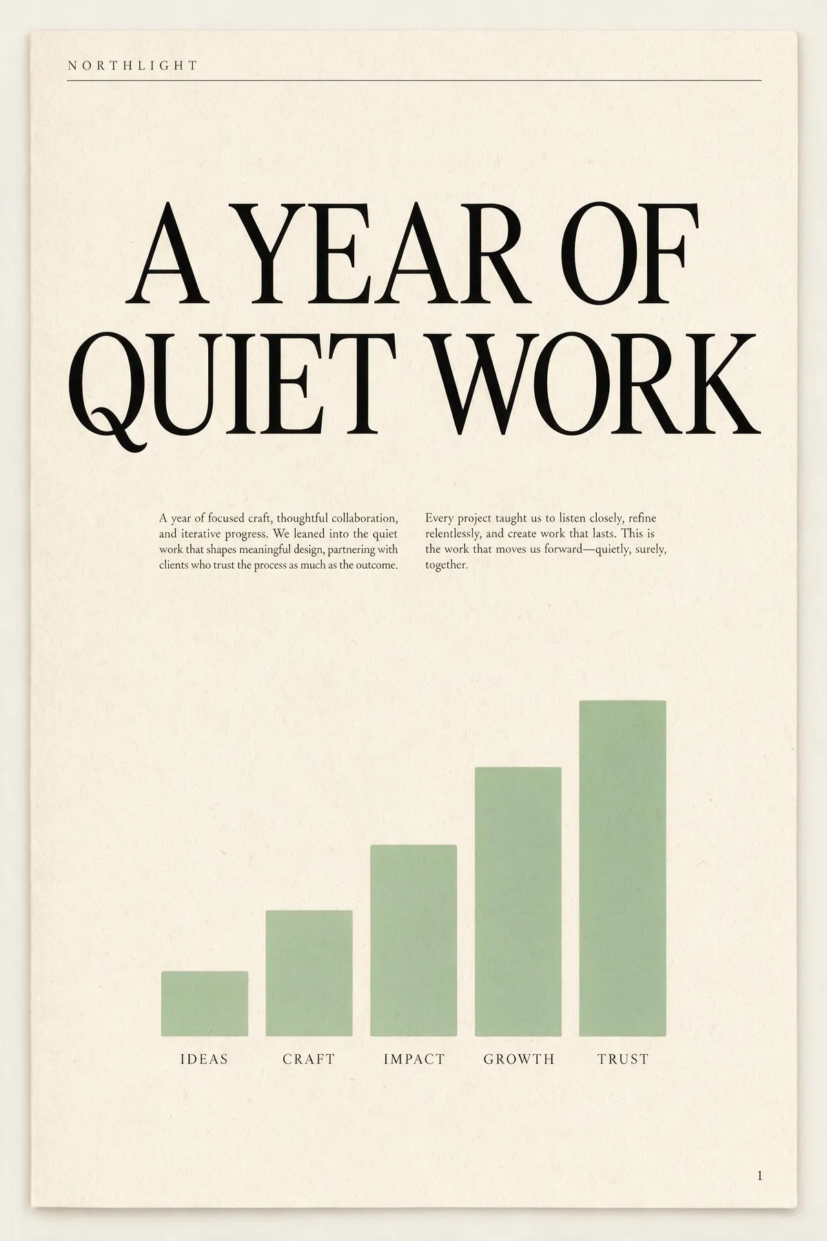
A single-page annual report cover for a design studio called NORTHLIGHT. Layout from top to bottom: a thin rule across the top with the studio name set small in wide-tracked uppercase on the left; below it a large two-line headline 'A YEAR OF QUIET WORK' set in a high-contrast serif; under the headline a short two-column block of small body copy; in the lower half a simple bar chart of five ascending bars in muted sage green with a one-word label under each bar; and a page number set small in the bottom right corner. Cream paper, ink-black type, one sage accent, generous margins, genuinely typeset editorial hierarchy.
A concert poster for a jazz quartet. Layout: at the top, the venue name 'BLUE ROOM' set small in uppercase with wide letter-spacing; centred beneath it the band name 'THE MERIDIAN FOUR' as the dominant headline in a heavy condensed sans; under the headline a single line giving a date and a time; in the middle of the poster a duotone photograph of a double bass in deep indigo and warm amber; below the image a three-line list of supporting acts set in small type, each line separated by a thin rule; and at the very bottom a row of four small sponsor marks as abstract geometric shapes. Confident modern layout, strong typographic hierarchy, indigo and amber palette.

両方のブリーフは、8つ以上の位置指示を含む密度の高い1つの段落。どちらの画像も再生成もレタッチもバッチからの選別もしていない。