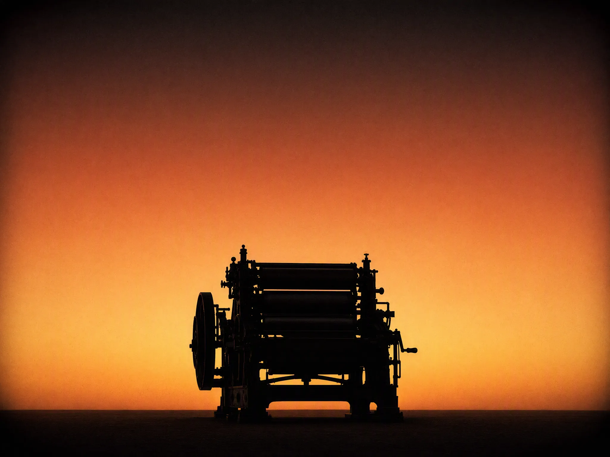
排出來就是排好版的版面
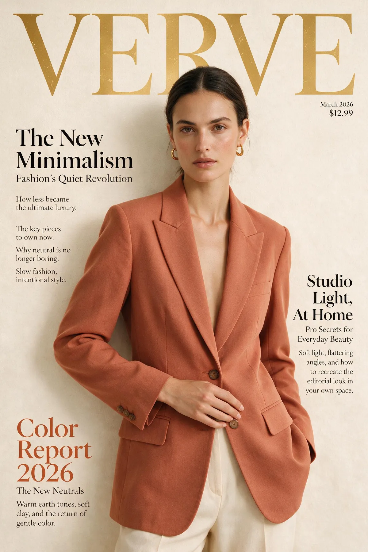
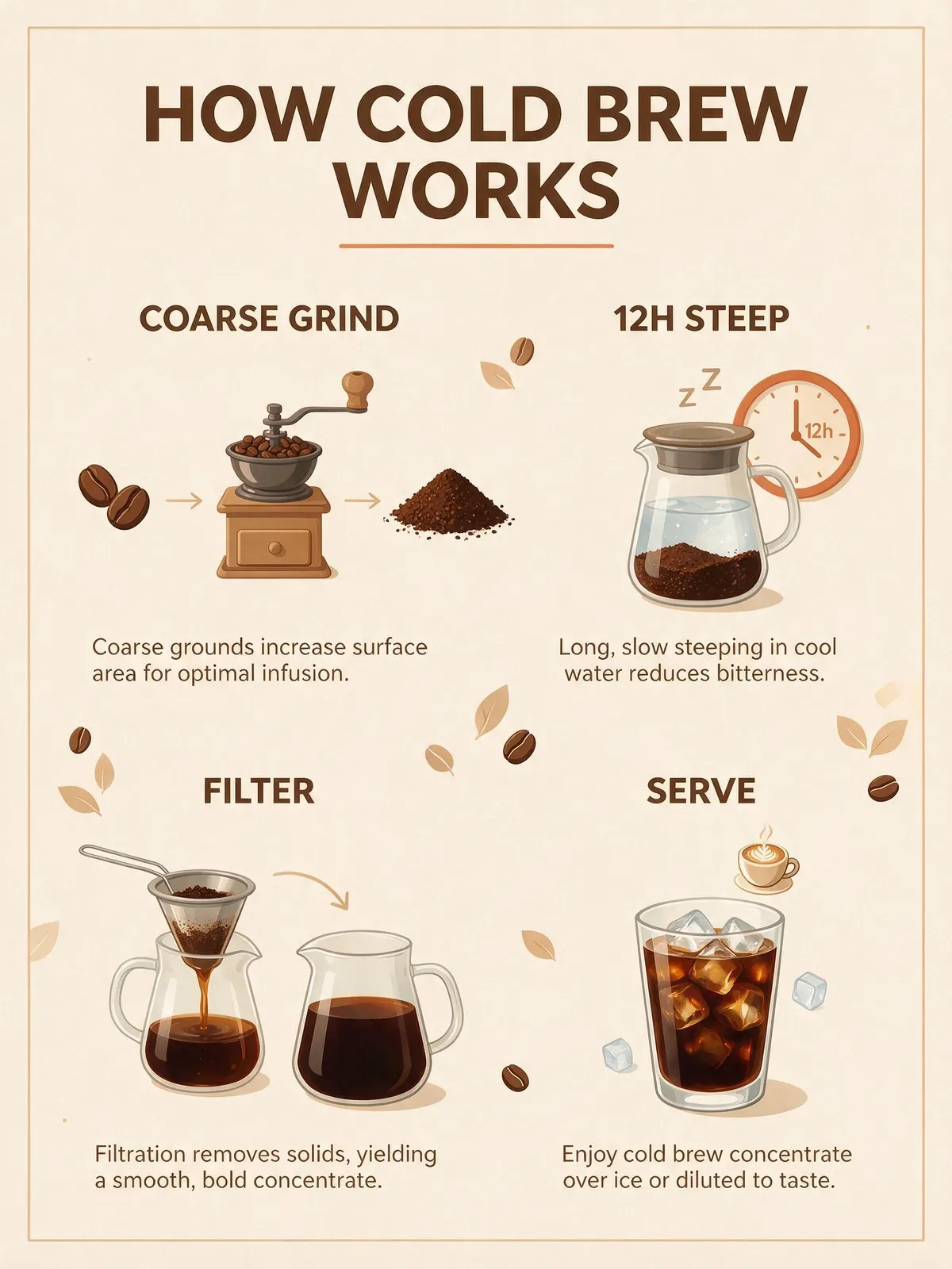
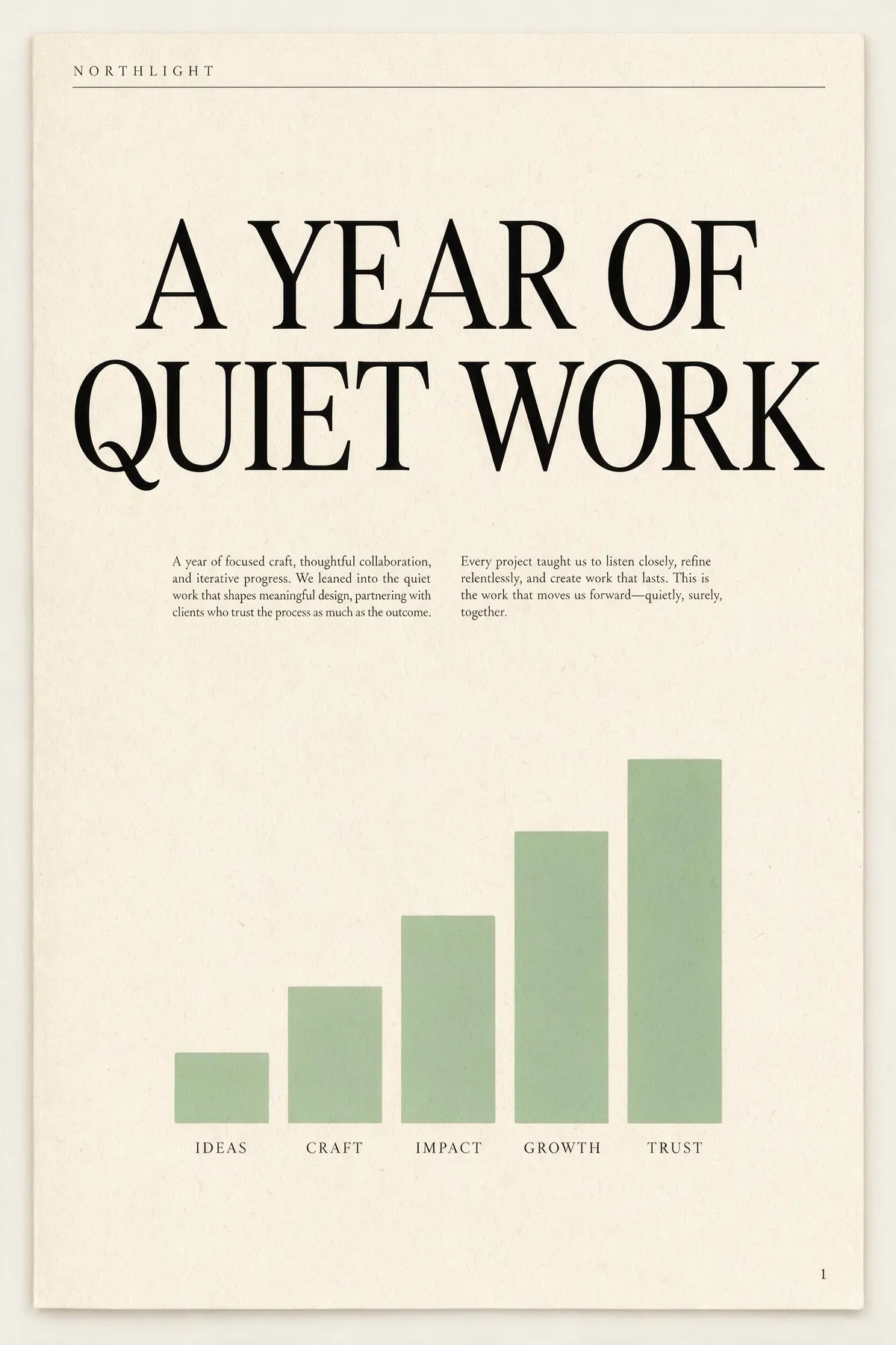
官方的說法是「超越生成——它理解設計」,而這正是這一點顯形的地方。給它一條寫明各個組成部分的版面指令,它會先把層級搭好再渲染:報頭、大標題、導言、內文分欄、圖說、頁尾。下面兩張是長指令(各為單獨一段)的首次出圖、未經修改;對照旁邊的提示詞數一數,有多少條要求真的落到了畫面上。這個字級的內文通常正是圖像模型崩成鬼畫符的地方——這裡它仍是真實、可讀的英文。
A single-page annual report cover for a design studio called NORTHLIGHT. Layout from top to bottom: a thin rule across the top with the studio name set small in wide-tracked uppercase on the left; below it a large two-line headline 'A YEAR OF QUIET WORK' set in a high-contrast serif; under the headline a short two-column block of small body copy; in the lower half a simple bar chart of five ascending bars in muted sage green with a one-word label under each bar; and a page number set small in the bottom right corner. Cream paper, ink-black type, one sage accent, generous margins, genuinely typeset editorial hierarchy.
A concert poster for a jazz quartet. Layout: at the top, the venue name 'BLUE ROOM' set small in uppercase with wide letter-spacing; centred beneath it the band name 'THE MERIDIAN FOUR' as the dominant headline in a heavy condensed sans; under the headline a single line giving a date and a time; in the middle of the poster a duotone photograph of a double bass in deep indigo and warm amber; below the image a three-line list of supporting acts set in small type, each line separated by a thin rule; and at the very bottom a row of four small sponsor marks as abstract geometric shapes. Confident modern layout, strong typographic hierarchy, indigo and amber palette.

兩條指令都是單獨一大段,各含八條以上的位置要求。兩張圖都沒有重跑、沒有修圖,也不是從一批裡挑出來的。