조판되어 돌아오는 레이아웃
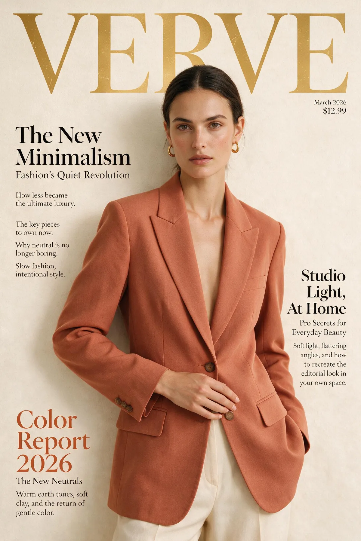
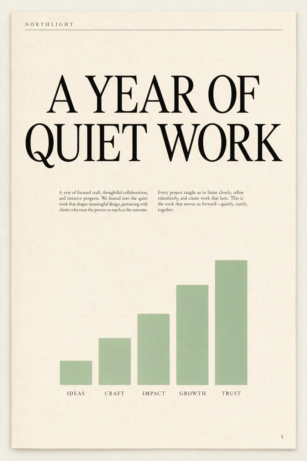
공식 피치는 “생성을 넘어 — 디자인을 이해한다”이고, 바로 여기서 드러납니다. 이름 붙인 요소가 있는 레이아웃 브리프를 주면 렌더 전에 위계를 만듭니다: 마스트헤드, 헤드라인, 데크, 본문 칼럼, 캡션, 푸터. 아래 둘은 긴 단일 단락 브리프에서 나온 무편집 첫 테이크입니다. 각 옆의 프롬프트를 읽고 지시가 실제로 몇 개나 반영됐는지 세어 보세요. 이 크기의 본문은 보통 이미지 모델이 꾸불꾸불 무너지는 지점입니다 — 여기서는 실제로 읽히는 영어로 남습니다.
A single-page annual report cover for a design studio called NORTHLIGHT. Layout from top to bottom: a thin rule across the top with the studio name set small in wide-tracked uppercase on the left; below it a large two-line headline 'A YEAR OF QUIET WORK' set in a high-contrast serif; under the headline a short two-column block of small body copy; in the lower half a simple bar chart of five ascending bars in muted sage green with a one-word label under each bar; and a page number set small in the bottom right corner. Cream paper, ink-black type, one sage accent, generous margins, genuinely typeset editorial hierarchy.
A concert poster for a jazz quartet. Layout: at the top, the venue name 'BLUE ROOM' set small in uppercase with wide letter-spacing; centred beneath it the band name 'THE MERIDIAN FOUR' as the dominant headline in a heavy condensed sans; under the headline a single line giving a date and a time; in the middle of the poster a duotone photograph of a double bass in deep indigo and warm amber; below the image a three-line list of supporting acts set in small type, each line separated by a thin rule; and at the very bottom a row of four small sponsor marks as abstract geometric shapes. Confident modern layout, strong typographic hierarchy, indigo and amber palette.

두 브리프 모두 위치 지시가 8개 이상인 하나의 빽빽한 단락입니다. 두 이미지 모두 재시도, 리터칭, 배치 선별 없이 나왔습니다.