เลย์เอาต์ที่กลับมาเหมือนผ่านการจัดพิมพ์
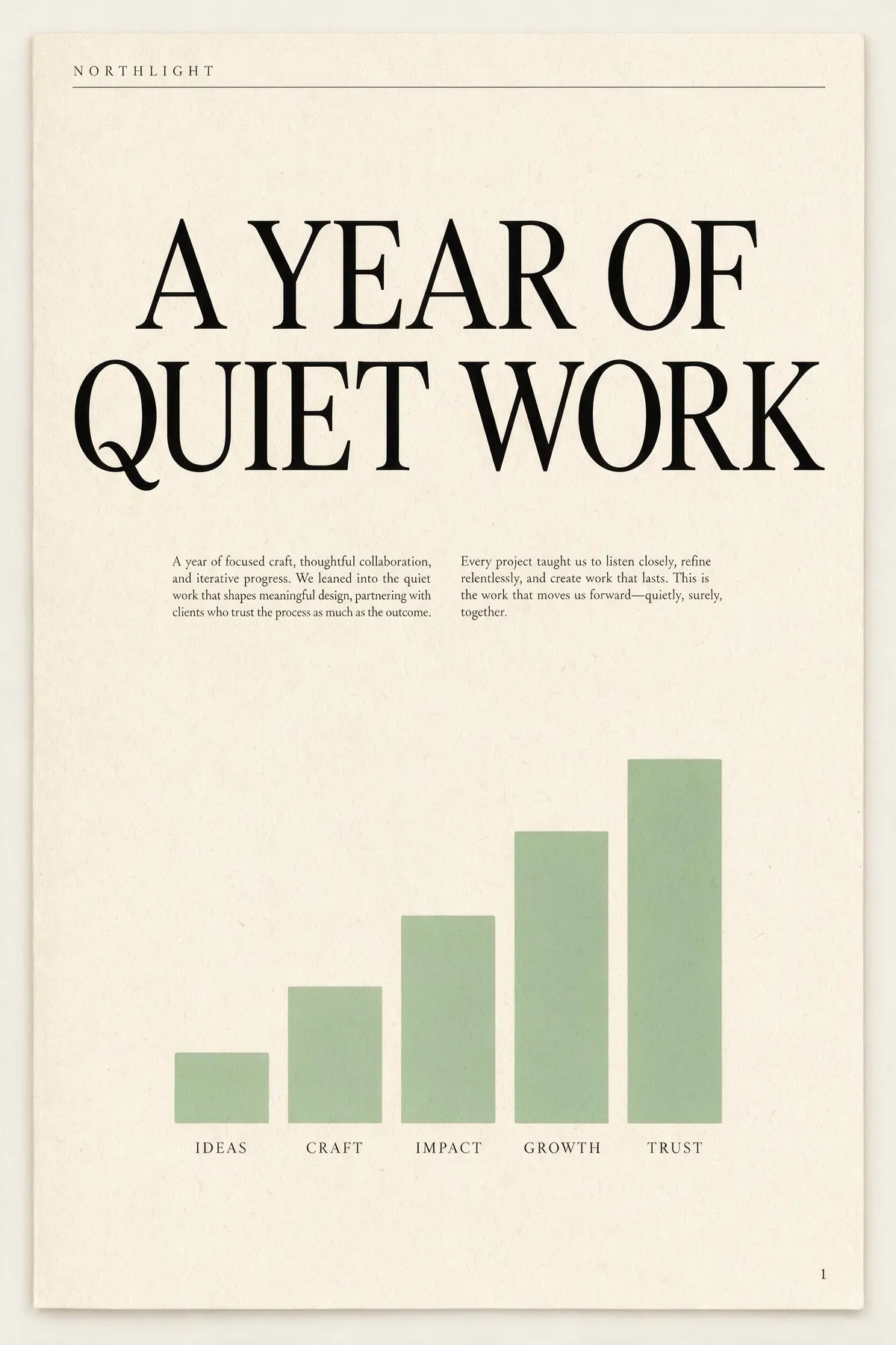
คำโปรยทางการคือ "เกินกว่าการสร้างภาพ — มันเข้าใจงานออกแบบ" และนี่คือจุดที่มันแสดงออก ให้บรีฟเลย์เอาต์ที่ระบุชื่อส่วนต่างๆ มันจะสร้างลำดับชั้นก่อนเรนเดอร์: ป้ายชื่อ พาดหัว คำโปรย คอลัมน์เนื้อความ คำบรรยาย ส่วนท้าย สองภาพด้านล่างเป็นผลครั้งแรกที่ไม่ได้แก้ไขจากบรีฟย่อหน้าเดียวยาวๆ; อ่านพรอมป์ตข้างแต่ละภาพแล้วนับว่าคำสั่งลงจริงกี่ข้อ เนื้อความขนาดนี้ปกติเป็นจุดที่โมเดลภาพพังเป็นเส้นขยุกขยิก — ที่นี่มันยังเป็นภาษาอังกฤษจริงที่อ่านได้
A single-page annual report cover for a design studio called NORTHLIGHT. Layout from top to bottom: a thin rule across the top with the studio name set small in wide-tracked uppercase on the left; below it a large two-line headline 'A YEAR OF QUIET WORK' set in a high-contrast serif; under the headline a short two-column block of small body copy; in the lower half a simple bar chart of five ascending bars in muted sage green with a one-word label under each bar; and a page number set small in the bottom right corner. Cream paper, ink-black type, one sage accent, generous margins, genuinely typeset editorial hierarchy.
A concert poster for a jazz quartet. Layout: at the top, the venue name 'BLUE ROOM' set small in uppercase with wide letter-spacing; centred beneath it the band name 'THE MERIDIAN FOUR' as the dominant headline in a heavy condensed sans; under the headline a single line giving a date and a time; in the middle of the poster a duotone photograph of a double bass in deep indigo and warm amber; below the image a three-line list of supporting acts set in small type, each line separated by a thin rule; and at the very bottom a row of four small sponsor marks as abstract geometric shapes. Confident modern layout, strong typographic hierarchy, indigo and amber palette.

บรีฟทั้งสองเป็นย่อหน้าเดียวที่แน่นด้วยคำสั่งเรื่องตำแหน่งแปดข้อขึ้นไป ไม่มีภาพไหนถูกสร้างใหม่ แต่งแต้ม หรือคัดมาจากชุดภาพ