לייאאוטים שחוזרים מסותרים
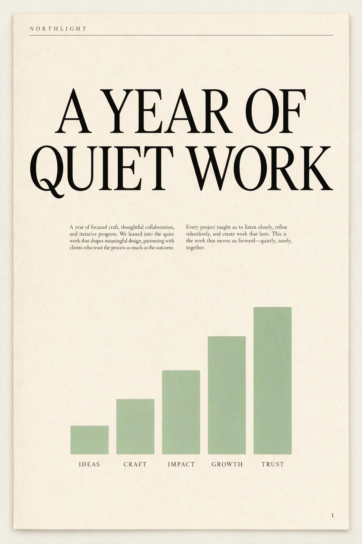
הפיץ' הרשמי הוא "מעבר ליצירה — הוא מבין עיצוב", וכאן זה בא לידי ביטוי. תנו לו בריפ לייאאוט עם חלקים בעלי שמות והוא בונה את ההיררכיה לפני שהוא מרנדר: כותרת עליונה, כותרת ראשית, כותרת משנה, עמודות גוף, כיתובים, כותרת תחתונה. שני אלה שלמטה הם ניסיונות ראשונים לא ערוכים מבריפים ארוכים של פסקה אחת; קראו את הפרומפט ליד כל אחד וספרו כמה מההנחיות באמת התממשו. טקסט גוף בגודל הזה הוא בדרך כלל המקום שבו מודלי תמונה מתפרקים לשרבוטים — כאן הוא נשאר אנגלית אמיתית וקריאה.
A single-page annual report cover for a design studio called NORTHLIGHT. Layout from top to bottom: a thin rule across the top with the studio name set small in wide-tracked uppercase on the left; below it a large two-line headline 'A YEAR OF QUIET WORK' set in a high-contrast serif; under the headline a short two-column block of small body copy; in the lower half a simple bar chart of five ascending bars in muted sage green with a one-word label under each bar; and a page number set small in the bottom right corner. Cream paper, ink-black type, one sage accent, generous margins, genuinely typeset editorial hierarchy.
A concert poster for a jazz quartet. Layout: at the top, the venue name 'BLUE ROOM' set small in uppercase with wide letter-spacing; centred beneath it the band name 'THE MERIDIAN FOUR' as the dominant headline in a heavy condensed sans; under the headline a single line giving a date and a time; in the middle of the poster a duotone photograph of a double bass in deep indigo and warm amber; below the image a three-line list of supporting acts set in small type, each line separated by a thin rule; and at the very bottom a row of four small sponsor marks as abstract geometric shapes. Confident modern layout, strong typographic hierarchy, indigo and amber palette.

שני הבריפים הם פסקה אחת צפופה עם שמונה הנחיות מיקום או יותר. אף תמונה לא נוסתה מחדש, לא עברה ריטוש ולא נבחרה מתוך אצווה.