ایسے layouts جو typeset ہو کر واپس آتے ہیں
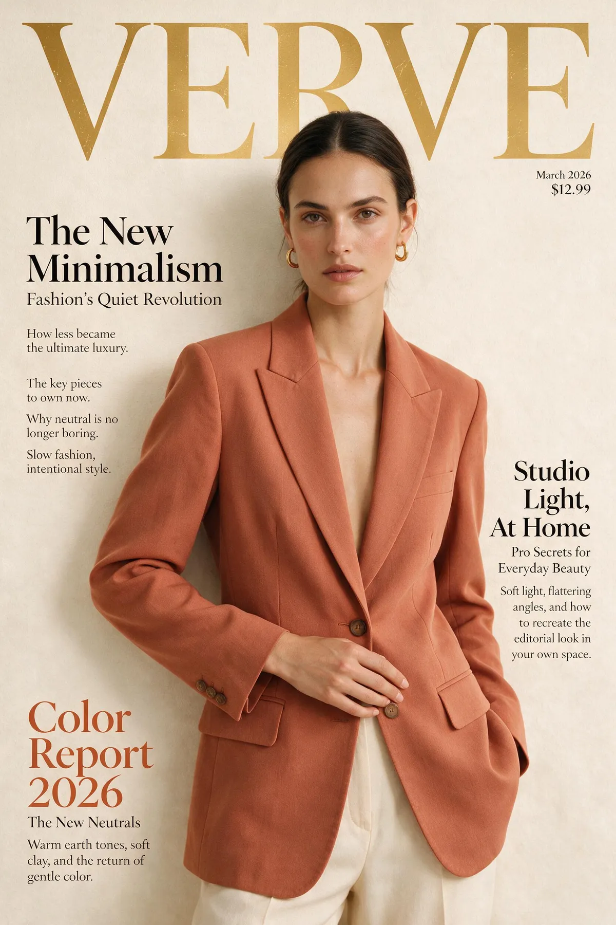
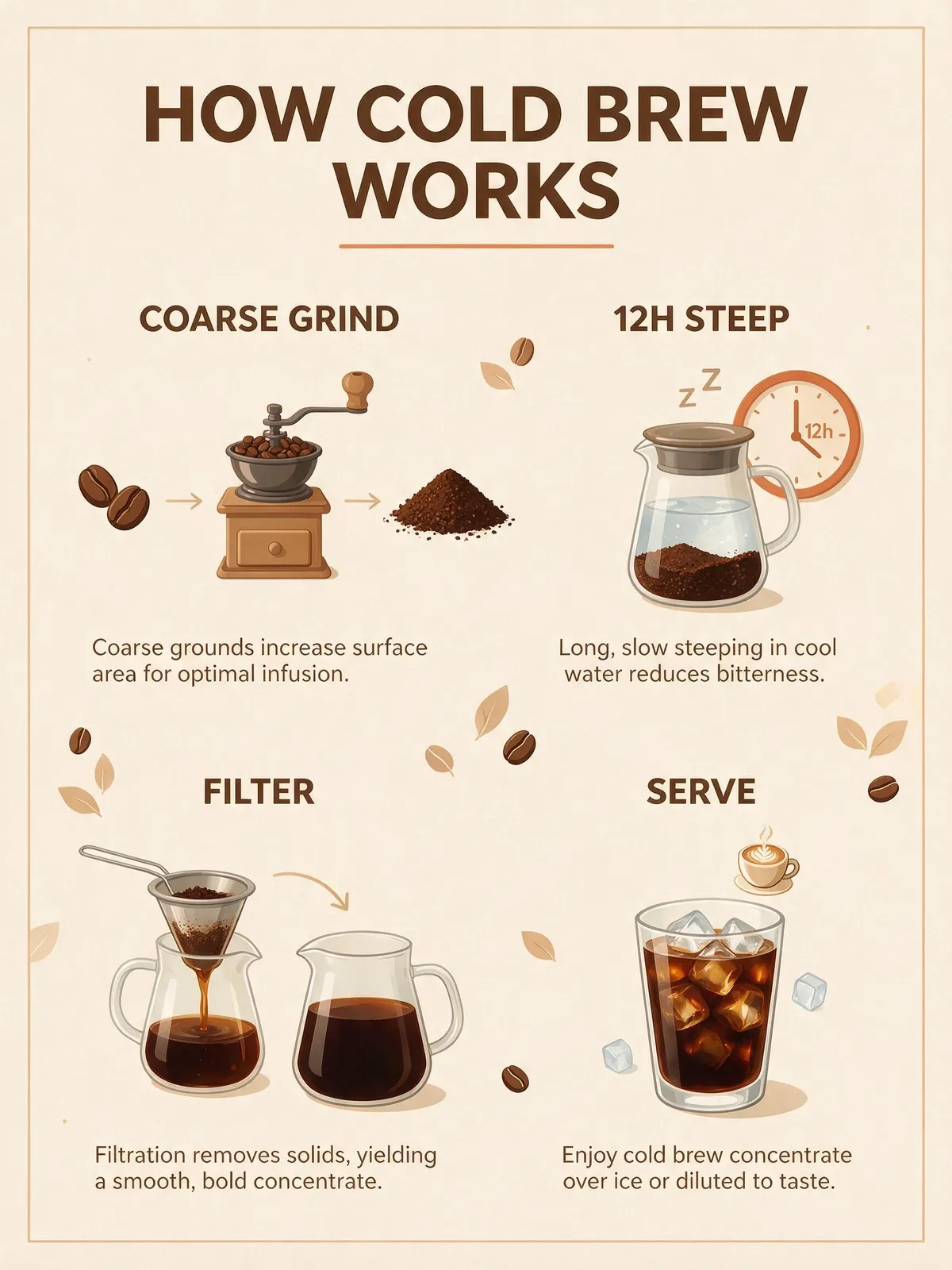
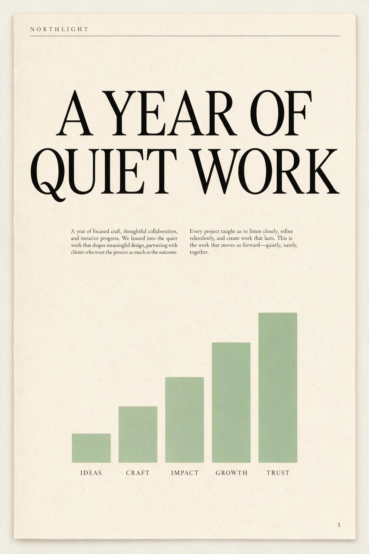
official pitch یہ ہے «beyond generation — it understands design»، اور یہی وہ جگہ ہے جہاں یہ نظر آتا ہے۔ اسے named parts والا layout brief دیں اور وہ render کرنے سے پہلے hierarchy بناتا ہے: masthead، headline، deck، body columns، captions، footer۔ نیچے والے دو لمبے single-paragraph briefs سے غیر ترمیم شدہ first takes ہیں؛ ہر ایک کے پاس پرامپٹ پڑھیں اور گنیں کہ ہدایات میں سے کتنی واقعی اتریں۔ اس سائز کا body copy عام طور پر وہ جگہ ہے جہاں image models squiggles میں بکھر جاتے ہیں — یہاں یہ حقیقی، پڑھنے کے قابل English رہتا ہے۔
A single-page annual report cover for a design studio called NORTHLIGHT. Layout from top to bottom: a thin rule across the top with the studio name set small in wide-tracked uppercase on the left; below it a large two-line headline 'A YEAR OF QUIET WORK' set in a high-contrast serif; under the headline a short two-column block of small body copy; in the lower half a simple bar chart of five ascending bars in muted sage green with a one-word label under each bar; and a page number set small in the bottom right corner. Cream paper, ink-black type, one sage accent, generous margins, genuinely typeset editorial hierarchy.
A concert poster for a jazz quartet. Layout: at the top, the venue name 'BLUE ROOM' set small in uppercase with wide letter-spacing; centred beneath it the band name 'THE MERIDIAN FOUR' as the dominant headline in a heavy condensed sans; under the headline a single line giving a date and a time; in the middle of the poster a duotone photograph of a double bass in deep indigo and warm amber; below the image a three-line list of supporting acts set in small type, each line separated by a thin rule; and at the very bottom a row of four small sponsor marks as abstract geometric shapes. Confident modern layout, strong typographic hierarchy, indigo and amber palette.

دونوں بریف ایک ہی گھنا پیراگراف ہیں جس میں آٹھ یا زیادہ پوزیشنل ہدایات ہیں۔ نہ کوئی تصویر دوبارہ بنائی گئی، نہ ری ٹچ کی گئی، نہ بیچ سے چنی گئی۔